Tuesday, October 7, 2008

Cubism and Gestalt

This is a painting by cubist artist Georges Braque, entitled Violin and Candlestick. When first looking at this piece, there is a definite tension between understanding it for how it realistically looks, and then extracting some sort of intellectualized understanding of what it's intended to portray. This is a common theme in Gestalt analysis: how do I organize the components of this image? how does that understanding change when logic and reason are injected into the equation?
This painting represents the study of Gestalt simplicity in that it forces the viewer to reconsider what it is actually portraying. At first glance it looks like a bunch of forms arranged in a relatively well balanced way through the usage of colors and different shapes. However, the viewer is given a set through the name of the piece. By calling this piece "violin and candlestick" the viewer must now "find" the violin and candlestick, and contextualize the background to appropriately suit a scene where one may see a violin and a candlestick. This stream of consciousness that the viewer must go through when analyzing this painting is a good example of an artist composing simple forms in such a way that a sophisticated understanding is necessary. 

Monday, October 6, 2008

Moholy-Nagy's Balance Study (1924) reconstructed in 1967 is an example of an exploration of Gestalt principles. You can see Moholy-Nagy's interest in balance and basic line through his use of the circular and rectangular shapes. Something that I also noticed was the negative space within the circles on the top and the bottom of the figure. That space must be considered in the balance as well. Each piece is contributing to the balance of the object as a whole.

The Bright Side


This piece caught my attention because of its use of shape and color, and how they work together to create form. This artwork conveys weight-- the "Weimar," despite its weight, is balancing on top of this intricate structure. Interestingly enough, this structure seems to be quite unbalanced-- leaning to the right, in fact. I would assume that the Klee did this on purpose to indicate the instability of "Weimar."

The background is blue, and all spaces in between the structure that are blue indicate free space. Similarly, all shapes that touch a shape of the same color are connected; the red triangles form to make a red hourglass shape. I assume that all of the different colored pieces are separate.

When you convert the image to greyscale, the blue and yellow become hard to distinguish between. This makes the figure-ground distinction more difficult, which can make the structure appear different.
This is Paul Klee's "Head of Man, Going Senile," and I think it is a great example of Gestalt ideas.  As Behrens said, "a whole is not simply the sum of its parts, but a synergistic 'whole effect,' or gestalt."  Looking at this painting, we see clear parts.  We see clear shapes, some of them recognizable geometric shapes, like the two red circles and the different colored squares.  But this painting is not simply a combination of circles and squares.  The shapes interact with each other, as does the color, and creates an image, a "whole effect," a "gestalt."  Many of the things Arnheim has discussed are illustrated in this painting, and play a part in creating the "gestalt."  It is the differences in color that create the shapes because the different colors next to each other have created contours.  While the painting is not exactly symmetrical, I would say it has a sense of balance because there is an equal weight distribution on both sides.  The head tilts to our right, but, as you can see, the "body" of the man is smaller on the right than the left in order to compensate, thus balancing the picture out.  Also, what plays a huge part in "reading" this picture is our past visual experience.  As Arnheim says, "Every visual experience is embedded in a context of space and time" (48).  Just as we can recognize figure 19 in the chapter on shape as a face, we recognize this image as a face, because of our familiarity with the human face.  Also, the title of the painting plays a part in the process, just as our interpretation of the Picasso painting put up is influenced once we learn it is a man playing an accordian.  Figure 21 in the chapter on shape can be seen as diagonal lines with two white triangles in the upper left and lower right corners, but once we are told it is a giraffe passing through a window, our view of the image changes.  In the same way, the title to this painting influences the way we see it.

Mapping the Gestalt


Jasper Johns, heralded as the first pop artist, relied heavily on the viewer’s cultural knowledge to convey the full meaning of his artwork. Without utilizing the Gestalt top-down processing Johns’ painting Map would appear nothing but somewhat regularly shaped splotches of color. But by drawing on my outside knowledge I realize it’s actually a map of the United States. This is initially difficult to make out partly because the outlines are not sharply defined. The undefined shapes that make up the states are not clear enough for immediate recognition and their ambiguity encourages me to draw on my visual memory. Arnheim points out that this process “is a matter of the relative strength of the stimulus structure as compared with the structural strength of the pertinent [memory] traces”(39). Johns also does not provide any center of balance so the painting appears restless. As a result our eyes have no place to rest so we also feel agitated.

Gestalt and The Stage


The stage was another medium for which to express Gestalt ideas. From 1921 to 1929 the Bauhaus theater became “a meeting point of the metaphysical.” Actors wore colorful, geometric body masks and used movement and sound to convey their intentions. Although it was looked down upon by many of their members, it took Gestalt ideas to a new level. Here is an image by Schawinsky that depicts what the theater may have been like.

Gestalt, Abstraction, Figure & Ground

Paul Klee. Fire in the Evening. 1929

This Painting by Paul Klee encompasses many of the key features of Gestalt that we have discussed thus far: a dynamic interaction of colors and contours, a unified and balanced composition, and an interchanging dimensional relationship between figure and ground. While the title and the colors are reminiscent of a sunset, the painting is very much abstract. The abstraction nevertheless captures the essence of the referent without needing to portray it explicitly. As a formal engagement with color, form, depth and composition the painting is extremely interesting as well. The careful juxtapositions of color in bands of varying width creates an ambiguous sense of depth. Here we see that the borders/contrast between the colors and the contours give the perception of figure and ground. This practice is a clear application of Arnheim's discussion of our changing perception of colors based on their surroundings. The composition also strongly reflects the ideas in the diagrams and descriptions of Gestalt principles taught in Klee's classroom: " Klee showed his students how to experiment with overlapping figures. If two different line drawings are laid over each other they are perceived as two transparent figures until, in a specific figuration, they are perceived as one whole or one Gestalt." (Van Campen 133)

Also this quote is nice for describing the Gestalt and our perception of it. "So smoothly are they blended into a whole of great overall simplicity, so organically is the compositional pattern derived from the subject and the pictorial medium, that we seem to see simple nature at the same time that we marvel at the intelligence of the interpretation it conveys." (Arnheim, 156)

Kandinsky and Itten

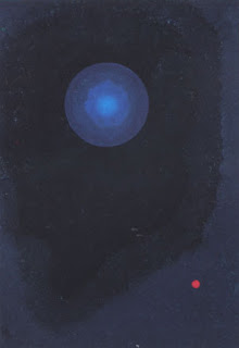
This image, Blue by Wassily Kandinsky 1927, is a good example of what Arnheim meant when he wrote, "like Mondrian and Kandinsky, he can work with completely nonmimetic shapes, which reflect human experience by pure visual expression and spatial relations." (Arnheim 145) My brain worked with the large blue sphere in a couple of ways. The first was as a planet in an outer space realm of galactic blue. The tiny red sphere could be a planet further away in this galaxy. Another way to look at this painting is the blue sphere is a small marble on a large ink splot and the red dot is an image of a lazer point being shined on the ink. Either way I view the painting, my mind seems to use the Gestault to come up with these ideas. In both instances the blue background, either viewed as space or ink splot, is what Arnheim would call "a Gestault" (68).


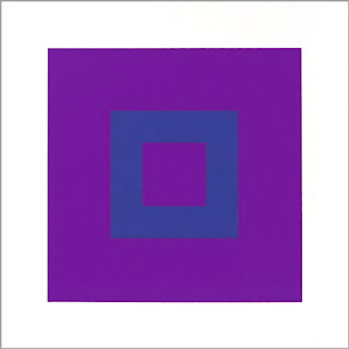
This work, Kunst der Farbe, by Johannes Itten evokes Arnheim's explanation of simplicity, leveling and the whole. (66, 67) It is possible that Itten had this in mind when he painted his many Kunsts der Farbes. The simplicity of the square shapes gives power to the two colors used in this work. Itten was a color theorist at the Bauhaus and wrote The Art of Color. I also think about Arnheim's explanation on "levels of abstraction". While I am not sure I fully understand what he meant when he wrote, "when by some circumstance the mind is freed from its usual allegiance to the complexities of nature, it will organize shapes in accordance with the tendencies that govern its own functioning. We have much evidence that the principal tendency at work here is that toward simplest structure, i.e., toward the most regular, symmetrical, geometrical shape attainable under the circumstances." (145) I get the feeling that Itten's work speaks to this idea.

Sunday, October 5, 2008

Cubism and Artistic Imagination


With the onset of the Cubist movement, the viewer was forced to look beyond the disjointed viewpoints and peculiar rendering of the flat planes in order to see the image that lied beneath. Prior to this radical movement artists were much more undemanding of the spectator because they provided them with a straight-forward view of their subject matter. Cubism required people to train their minds to perceive everyday objects amid a haze of shapes and varying perspectives. Take Picasso’s “The Accordionist” done in 1912, for example. At first glance it appears to be a jumble of cacophonous forms with no accordion player in sight. It is only after one stares at it long enough that the outline of the man starts to become visible. In my modern art lecture the professor told us about a quote that Picasso’s art collector, Daniel-Henri Kahnweiler said of the Cubist movement. He said that the viewer has to do work in order to comprehend a cubist piece or else they will not see anything past the surface. During my group conference for the same class, the subject of primitivism was also a major point of discussion and I think it ties into Arnheim’s chapter on Form very nicely. We defined “primitive” as not detailed, simple, natural, unrefined, abstract and primary. Artists like Gougouin and Picasso had a fascination with primitive cultures and the artwork they produced and even had collections of their own that included masks, etc. This inspired them to take a similar approach and incorporate these aspects into their own work. I personally find it ironic, however, that Cubism was influenced by something so basic and rudimentary because to me, when I look at a cubist work my eyes feel strained from the complexity of form.
I was also intrigued by Arnheim’s discussion on artistic imagination. He described it as “finding new form for old content” or a “fresh conception of an old subject.” The part that resonated with me the most was when he wrote, “There is more imagination in the way Titian paints a human hand than in hundreds of surrealist nightmares depicted in a dull, conventional manner.” (142) This is something I have never considered before because my obvious instinct would be to convince myself that one of Dali’s fanciful, dreamlike paintings was much more imaginative than any single body part portrayed in a new way. Do you think there is truth to what Arnheim said or do you think that one is simply a more overt form of imagination while the other is a more abstract way of looking at it? The topic of surrealism brings me to my final point. Figure 111 done by the schizophrenic, Friedrich Schroder, a man who spent most of his adult life in mental hospitals and prisons, has some very surrealist qualities to it. Because of his mental illness the way in which he expressed himself artistically was different from that of an emotionally healthy person. His lines were rigid and symmetrical, depth was virtually eliminated and shapes were “devoid of their organic complexity and imperfection.” This occurs when someone who’s mind is “empty or concentrated on some other train of thought” still has their sense of visual organization that is telling their eyes and hands what to do. I guess the aesthetic similarities between schizophrenic art and surrealism makes me wonder how much imagination actually went in to Dali’s work for instance. If it physically looks so much like work done by a man who’s mind is said to be “empty” then how can it really be that imaginative? My uncle on my mother's side is schizophrenic and my grandfather on my father's side opened Gateway's mental hospital in Los Angeles, so I am curious to look into this topic futher and share what I find with everybody in class.

Impossibles


Arnheim writes about the cultural history of perspective and foreshortening in two dimensional representations of three-dimensional space. He writes about such representation as a paradox, whereby there are “appropriate and inappropriate ways of reading pictorial representations of space, and that the proper way is determined in each case by the style of a given period or developmental stage (134).” This painting, Impossibles, by Josef Albers plays with the viewer’s tendency to read depth, even when such a reading would be physically impossible. The viewer, based on a cultural familiarity with perspective, interprets this painting as two three-dimensonal cylinders even though the cylinders show contradictory and impossible points of view. It took me a long time to visualize this painting in two-dimensions without imposing depth; the left cylinder emphasizing circles and the right emphasizing ovals. Note the way that Albers uses larger shapes in the top half of the painting in order to balance the bottom-heavy effect.

Science/Art, Sensory, Kinesthetics, Culture

Arnheim writes that the mind “organizes shapes in accordance with the tendencies that govern its functioning. We have much evidence that the principal tendency at work here is that toward simplest structure (145).” Arnheim’s writing makes more sense to me as our class work fleshes out the connection between Gestalt principles and the underlying biological and physiological properties of vision. Wertheimer’s demonstration of the Phi phenomenon was really an “A-ha!” moment for me. That just shows how a visual experience can profoundly illustrate an abstract principle, perhaps in a way that language cannot.
Elizabeth has been stressing the point that science and art illustrate different ways to systematically examine human processes. Von Campen elaborates by writing about the common history of abstract art and experimental science. The science of art theory places what I interpreted as an essentialist conception of the artist’s pure perception of aesthetics. Yet, it seems to me that artists and scientists merely do deliberately what all humans do instinctively. Both scientists and artists use practical applications to systematically organize the world. Oliver Sacks case study of Mr. I certainly shows that an artist may have a different or enhanced perception of the world. Yet that experience is based on memory, experience, associations, and expectations, not innate perception. I find this a far more convincing theory than simply that artists possess “pure visibility.”
The concept of tension in art, posed by Arnheim last week, came up again in this week’s readings. Von Campen quotes Kandinsky stating, “composition is nothing other than the logically precise organization of those living forces encapsulated within elements in the guise of tensions.” Arnheim really contextualized tension and energy fields as having aesthetic, dramatic and psychological meaning. He seems to encompass both Kandinsky and Lipp’s theories.
I was a bit confused about how Lipps and Kandinsky’s theories differ on perception. Our current understanding of neural processing involves multiple, interactive pathways. How does this understanding of visual processing complicate the idea of the two-step process consisting of sensory registration and mental construction of forms? Does the two-step perception theory concept coincide at all with the “what” and “where” processing systems? It seems to me that sensory and mental processing do seem to coincide, on a very simplified level, with the distinct primitive and cortical pathways of visual information.
Arnheim makes a distinction between kinesthetic and visual awareness, again building on the idea of the body’s centrality in visual perception. Some of the work I read last semester in The Feeling Brain class emphasized the importance of listening to signals from with the body for cognitive and emotional tasks. Arnheim’s discussionof kinesthetics, in the context of visal processing, is interesting considering the large amount of work being done on the prevalence of sensory disorders among children. The work done in this area evidences the range of humans experience through their bodies and the effect of sensory processing for learning, cognition, etc. In essence, we are all over and understimulated to a certain extent. We have a range of varying proprioceptive and vestibular difficulties. Sensory awareness I just being more widely recognized as a huge part of self, learning and perception.
Behrens raises an interesting point about the Gestalt neglect of cultural or linguistic meaning. He writes that visual perception was isolated and trivialized. However, I thought that Arnheim’s discussion gives a lot of credence to how graphic arts traditions influence perception. Certainly his interest is in the universals of visual perception, but this theory encompasses cultural and individual differences. The illusionistic doctrine shows that the conventions of perspective are one cultural model, among many, that represents the three-dimensional world in two-dimensions. I wonder if others read Arnheim in a similar way or if I am imposing my post-structural theories onto his work. He also proposes that artists and cultural conventions of art represent the world in vastly different ways because they have different goals. I see this more and more as I examine children’s art from the Gestalt perspective. In self-portraiture each child adopts different conventions depending on what concepts, emotions or characteristics they want to emphasize. As Arnheim writes, different art “expresses a way of living, of being a person” and must also fulfill “the purpose of the drawing.” Those purposes are certainly culturally and linguistically determined.